
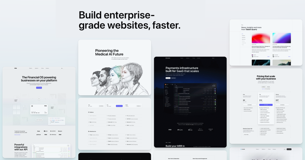
Tailark Pro is a comprehensive Shadcn UI blocks kit designed for building and scaling marketing websites. Key features include:
Ideal for:
Tailark Pro offers a complete solution for building modern marketing websites with a focus on speed, quality, and conversion optimization, leveraging the popular Shadcn UI library.
Tailark Pro is a developer tool listed on OpenHunts. The listing describes it as a comprehensive Shadcn UI blocks kit designed for building and scaling marketing websites.
Tailark Pro highlights *extensive block library, *complete pages, and *seamless integration. The listed feature details mention ways to ** Hundreds of beautifully crafted marketing blocks designed for conversion, ** Fully customizable pages in four unique styles, complete with exclusive blocks and illustrations, and ** Blocks seamlessly integrate with each other to help build high-performing marketing sites.
Tailark Pro is listed as paid on OpenHunts. Check the official website for current plan limits, trials, and billing details.
Tailark Pro is best for *web developers:** speed up development with pre-built ui components., *marketing teams:** create high-converting landing pages and marketing websites., and *designers:** quickly prototype and iterate on designs.. It is also useful for people comparing developer tools tools on OpenHunts.
Use the related projects section and category pages on OpenHunts to compare Tailark Pro with other developer tools tools by platforms, pricing, and community activity.
These tools are selected from similar categories, platforms, and community activity on OpenHunts.

Dice UI is a React component library that provides accessible and customizable UI elements built on top of shadcn/ui, React, TypeScript, and Tailwind CSS. Key features include:Accessible Components: Adheres to WAI-ARIA standards for enhanced usability.Copy-Paste Ready: Easily integrate components into your projects with minimal setup.Customizable: Tailor components to match your design system and branding.Shadcn/ui Integration: Seamlessly extends the popular shadcn/ui library.Ideal for:React developersFront-end engineersUI/UX designersDice UI offers a quick and efficient way to build accessible and visually appealing user interfaces, saving developers time and effort while ensuring inclusivity.

NextJS Starter is a streamlined foundation for building modern web applications with speed and reliability. Packed with pre-configured tools and best practices, it helps you focus on development instead of setup. Whether you’re a beginner or an expert, our curated NextJS starters give you everything you need to launch your project smoothly.

Mod is a CSS framework designed to accelerate SaaS app development. Key features include:Production-Ready Components: An ever-expanding library of pre-built UI components.SaaS-Specific Design: Components tailored for SaaS applications, ensuring a consistent and professional look.Customizable Styles: 168+ styles and themes to quickly adapt the framework to your brand.Ideal for:SaaS DevelopersUI/UX DesignersStartups building web applicationsMod helps developers ship faster by providing a comprehensive set of UI components, eliminating the need to build from scratch and ensuring a consistent, high-quality user experience.

Formedible is a React hook that simplifies form creation using schema validation and UI components. Key features include:Schema Validation: Built-in Zod validation for real-time error handling and type safety.Component Override: Easily replace default field components with custom implementations.Multi-Page Forms: Built-in pagination with customizable progress indicators.Custom Wrappers: Add styling, animations, or functionality to any field.Ideal for:React developers using TanStack Form and shadcn/ui.Teams needing robust, validated forms in their applications.Developers seeking a flexible and customizable form solution.Formedible streamlines form development, saving time and ensuring data integrity with its schema-driven approach and UI component integration.

IntroductionSmoothUI is a React UI component library that provides pre-built, customizable UI elements with smooth animations. Key features include:Animated Components: Built-in animations powered by Framer Motion for engaging user experiences.Tailwind CSS v4: Utilizes the latest utility-first CSS framework for enhanced dark mode and modern design patterns.React-Based: Built with modern React patterns, including Server Components, TypeScript, and hooks for optimal performance.Customizable: Highly customizable and production-ready UI blocks for building beautiful websites and apps.Ideal for:React developers seeking pre-built UI components.Designers and developers aiming for visually appealing and animated interfaces.Teams looking to accelerate UI development with customizable components.SmoothUI offers a delightful user experience with its built-in animations and modern design patterns, making it a valuable asset for any React project.