
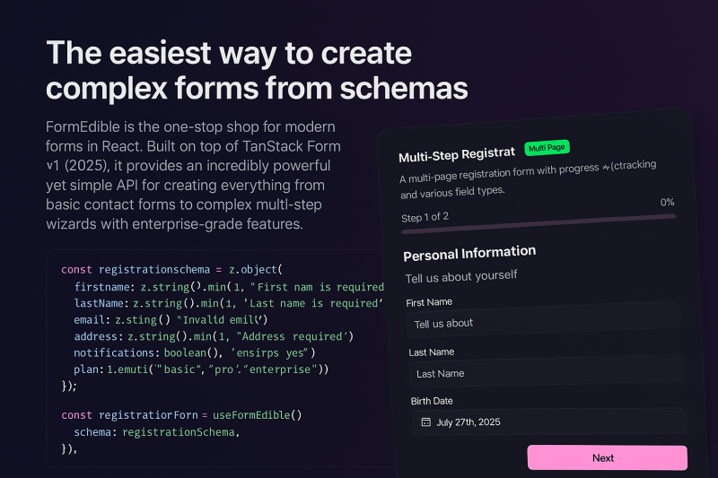
Formedible is a React hook that simplifies form creation using schema validation and UI components. Key features include:
Ideal for:
Formedible streamlines form development, saving time and ensuring data integrity with its schema-driven approach and UI component integration.

Intlayer is an open-source content management solution for multilingual apps in React, Next.js, Nuxt, Vue.js and Vite. It’s designed to help you build and manage multilingual content for your SaaS, side project, or any other internationalized app.Intlayer focuses on maintainability and scalability, helping teams keep their app structure clean while improving synchronization between developers. It offers a straightforward, flexible internationalization setup that helps speeding up the developement of multilingual applications. With Intlayer, developers and content creators can manage and evolve the same content simultaneously.✨ Key FeaturesCross-Framework Support → works across React, Next.js, Vue.js, Nuxt, Vite, and more.Auto-fill of translations → missing entries in your dictionaries are automatically completed, no more manual fixes.MCP Server → streamline i18n workflows and automate content management directly in your IDE.VSCode Extension → manage translations, build dictionaries, and keep content in sync right inside your editor.Type-Safe Environment → leverage TypeScript for error-free content definitions and IDE autocompletion.Built-in Testing Tools → catch missing translations before they ever reach production.💡 Perfect for developers who care about maintainability and scalability🧠 Coming soon:plugin-based outputs for i18next, next-intl react-intl & vue-i18nIntlayer for Svelte / SvelteKit developersFor developers: instead of maintaining bulky JSON files, Intlayer lets you define and access your multilingual content everywhere within your codebase, using either JSON or TypeScript files.👉 Intlayer is free and open-source. We just launched and would love your feedback!

A component library that provides pre-built UI blocks and components for Shadcn UI, React, and Tailwind projects. Key features include:Extensive Block Library: Access a vast collection of pre-designed UI blocks for various use cases.Component Variety: Utilize a wide range of Shadcn UI components.Seamless Integration: Copy and paste components directly into your project or install via the Shadcn CLI.Ideal for:Web developersUI/UX designersFront-end developersShadcnblocks streamlines the development process by offering ready-to-use, customizable UI elements, saving time and effort in building visually appealing and functional web applications.

Shadcraft is a production-ready UI kit and React component library built on top of shadcn/ui.It helps designers and developers move faster by starting from real components, real patterns, and real code, not abstract design systems or placeholder UI.Shadcraft includes a fully-featured Figma UI kit that mirrors the shadcn/ui ecosystem, plus an optional React kit that installs directly into your project via the shadcn CLI. Components, variants, tokens, and structure are aligned end to end, so design and code stay in sync.You get:All shadcn/ui components and blocks, ready to useAdvanced theming with design tokens and globals.cssA Figma kit that matches production code structureA React kit with clean, extensible componentsPatterns built for real products, not demosShadcraft is for teams who want to skip the setup, avoid rework, and ship high-quality interfaces faster, whether you are designing, building, or doing both.Built for modern stacks. Ready for production on day one.

Dice UI is a React component library that provides accessible and customizable UI elements built on top of shadcn/ui, React, TypeScript, and Tailwind CSS. Key features include:Accessible Components: Adheres to WAI-ARIA standards for enhanced usability.Copy-Paste Ready: Easily integrate components into your projects with minimal setup.Customizable: Tailor components to match your design system and branding.Shadcn/ui Integration: Seamlessly extends the popular shadcn/ui library.Ideal for:React developersFront-end engineersUI/UX designersDice UI offers a quick and efficient way to build accessible and visually appealing user interfaces, saving developers time and effort while ensuring inclusivity.

Tailark Pro is a comprehensive Shadcn UI blocks kit designed for building and scaling marketing websites. Key features include:**Extensive Block Library:** Hundreds of beautifully crafted marketing blocks designed for conversion.**Complete Pages:** Fully customizable pages in four unique styles, complete with exclusive blocks and illustrations.**Seamless Integration:** Blocks seamlessly integrate with each other to help build high-performing marketing sites.**Responsive Design:** Ensures websites look great on all devices.Ideal for:**Web Developers:** Speed up development with pre-built UI components.**Marketing Teams:** Create high-converting landing pages and marketing websites.**Designers:** Quickly prototype and iterate on designs.Tailark Pro offers a complete solution for building modern marketing websites with a focus on speed, quality, and conversion optimization, leveraging the popular Shadcn UI library.

AutoLocalise is a localization tool that helps developers instantly localize their JavaScript apps without managing i18n files. Key features include:Instant Localization: Translate apps into 100+ languages in under a minute.No File Management: Eliminates the need for JSON/YAML files.Simple Integration: Easy setup for React, React Native (Expo), and Next.js.Updates Without Redeploying: Push translation updates without needing to redeploy your app.Ideal for:React DevelopersReact Native DevelopersNext.js DevelopersStartups launching globallyAutoLocalise simplifies the localization process, allowing developers to focus on building their app while handling the translation complexity.