
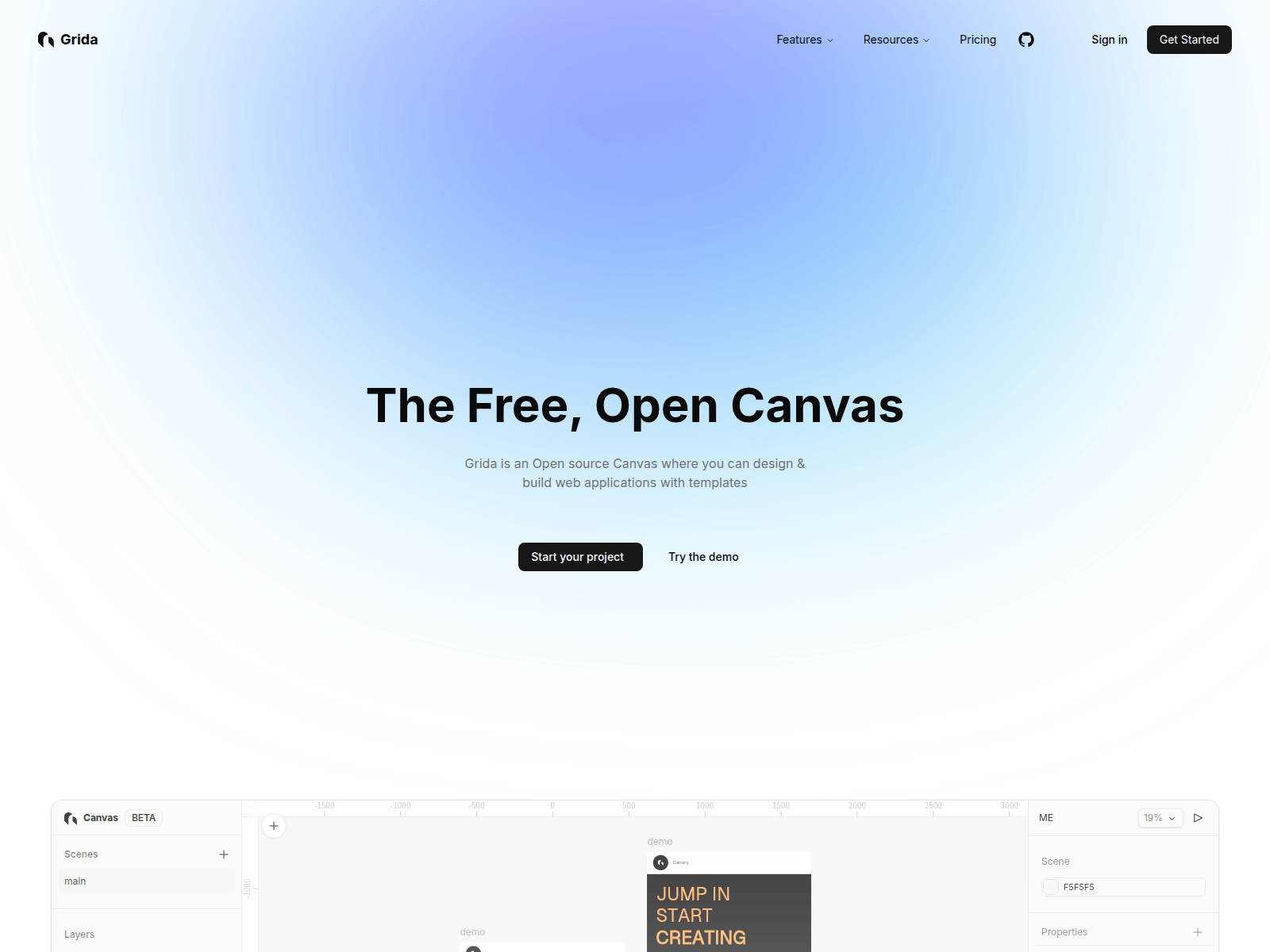
Grida is a free and open-source canvas editor that allows users to design and build web applications with customizable templates and components. Key features include:
Ideal for:
Grida stands out with its hackable architecture, modular SDK, and performance optimizations using Rust and WebGPU, making it a powerful and customizable tool for both individual developers and enterprise teams.
Grida is a design tool listed on OpenHunts. The listing describes it as a free and open-source canvas editor that allows users to design and build web applications with customizable templates and components.
Grida highlights visual website builder, ai-powered prompts, and figma integration. The listed feature details mention ways to design web pages visually with a drag-and-drop interface, utilize AI to generate design ideas and content, and import and export designs from Figma.
Grida is listed as free on OpenHunts. Check the official website for current plan limits, trials, and billing details.
Grida is best for ui/ux designers, web developers, and no-code enthusiasts. It is also useful for people comparing design tools tools on OpenHunts.
Use the related projects section and category pages on OpenHunts to compare Grida with other design tools tools by platforms, pricing, and community activity.


These tools are selected from similar categories, platforms, and community activity on OpenHunts.

200+ premium components. Early-bird from $29Tailkits UI is a modern library of 200+ HTML + Tailwind components for landing pages and marketing sites, designed to work with any framework that renders HTML. No config required.

Every Color Format. One Tool.Convert colors between 30+ formats instantly — HEX, RGB, HSL, OKLCH, CMYK, Tailwind, Bootstrap, Material Design, Flutter, SwiftUI, Jetpack Compose, ANSI terminal codes, and more.Features:Auto-detects any pasted color format and converts to all others - Preset palettes for 13 frameworks with nearest-match lookupsFramework prefix syntax (e.g., bulma:primary, tw:blue-500) for CSS framework colorsEyeDropper to pick colors from your screenLight/dark mode, configurable output groups100% client-side — no signup, no serverBuilt for developers and designers who work across multiple frameworks and platforms.

Color Picker is a web-based tool that simplifies color selection and gradient creation. Key features include:Image Color Extraction: Pick colors directly from uploaded images.Gradient Generation: Create linear and radial gradients with customizable stops.Color Code Conversion: Generate HEX, RGB, HSL, and HSV color codes.Trending Colors: Access a curated selection of popular color palettes.Ideal for:Web developersGraphic designersIllustratorsUI/UX designersColor Picker offers a lightweight, no-fuss solution for color manipulation, eliminating the need for heavyweight software and complex interfaces. It's designed for quick color grabbing, tweaking, and code copying.

I share lots of Design & UI screenshots. repeating same process for editing all this mockup images took too long, so I made a free tool for it that does all of this in few seconds.Basically,Drag and drop your screenshotsSelect one of hand-picked beautiful backgrounds.Apply some styles like border radius, colors, position, scaling.Export. that's basically it.

AVA Palettes is a Figma plugin that generates accessible color palettes instantly.Key features include:Perceptually Uniform Ramps: Creates visually consistent color ramps using OKLCH color space.WCAG & APCA Checks: Ensures color palettes meet accessibility standards with built-in contrast checkers.Pro-Level Control: Offers advanced customization options for fine-tuning color palettes.Ideal for:UI/UX DesignersWeb DevelopersDesign System TeamsAVA Palettes stands out by leveraging modern color science (OKLCH) to create beautiful and accessible palettes, ensuring brand consistency and compliance with accessibility guidelines.

IntroductionSmoothUI is a React UI component library that provides pre-built, customizable UI elements with smooth animations. Key features include:Animated Components: Built-in animations powered by Framer Motion for engaging user experiences.Tailwind CSS v4: Utilizes the latest utility-first CSS framework for enhanced dark mode and modern design patterns.React-Based: Built with modern React patterns, including Server Components, TypeScript, and hooks for optimal performance.Customizable: Highly customizable and production-ready UI blocks for building beautiful websites and apps.Ideal for:React developers seeking pre-built UI components.Designers and developers aiming for visually appealing and animated interfaces.Teams looking to accelerate UI development with customizable components.SmoothUI offers a delightful user experience with its built-in animations and modern design patterns, making it a valuable asset for any React project.