
SaaS product and website design engineering for early-stage teams. Slickful provides senior taste, sharp strategy, and fast execution for founders needing idea to MVP development. Key features include:
Ideal for:
Accelerate your product development from idea to live product without agency overhead.
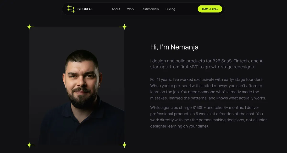
Slickful is a saas tool listed on OpenHunts. The listing describes it as SaaS product and website design engineering for early-stage teams. Slickful provides senior taste, sharp strategy, and fast execution for founders needing idea to MVP development.
Slickful highlights product design & front-end implementation, branding & strategy, and product audits. The listed feature details mention ways to from new MVPs to product redesigns for B2B SaaS, Fintech, and AI startups, develop strong brand identities and product strategies for growth, and identify areas for improvement in existing products.
Slickful is listed as paid on OpenHunts. Check the official website for current plan limits, trials, and billing details.
Slickful is best for early-stage saas founders, growth-stage startup teams, and fintech and ai product teams. It is also useful for people comparing saas tools on OpenHunts.
Use the related projects section and category pages on OpenHunts to compare Slickful with other saas tools by platforms, pricing, and community activity.
These tools are selected from similar categories, platforms, and community activity on OpenHunts.

Love Album - Collect All Your Wedding Photos in Real-TimeWedding guests take tons of photos, but most never share them. You end up with just the professional shots and maybe a few random pics in group chats.Love Album fixes this. Put a QR code on your tables. Guests scan it, upload their photos directly from their camera roll. No app install, no account needed. Takes 10 seconds.All photos land in a shared album that everyone can see during the event. Guests browse what others are posting, like their favorites, and keep uploading throughout the night. You watch your wedding album grow in real-time.On average, couples collect 547 photos from their guests. That's 547 unique perspectives, candid moments, and memories you'd never see otherwise.After the event, download everything. You own all the photos, full resolution, ready for printing or sharing.Works for any celebration where people take photos - birthdays, reunions, corporate events. But we built it for weddings first.

Build sleek, beautiful UIs with Shadyx UI – a modern and customizable component kit built with Next.js and Tailwind CSS.

IntroductionSmoothUI is a React UI component library that provides pre-built, customizable UI elements with smooth animations. Key features include:Animated Components: Built-in animations powered by Framer Motion for engaging user experiences.Tailwind CSS v4: Utilizes the latest utility-first CSS framework for enhanced dark mode and modern design patterns.React-Based: Built with modern React patterns, including Server Components, TypeScript, and hooks for optimal performance.Customizable: Highly customizable and production-ready UI blocks for building beautiful websites and apps.Ideal for:React developers seeking pre-built UI components.Designers and developers aiming for visually appealing and animated interfaces.Teams looking to accelerate UI development with customizable components.SmoothUI offers a delightful user experience with its built-in animations and modern design patterns, making it a valuable asset for any React project.

A component library that provides pre-built UI blocks and components for Shadcn UI, React, and Tailwind projects. Key features include:Extensive Block Library: Access a vast collection of pre-designed UI blocks for various use cases.Component Variety: Utilize a wide range of Shadcn UI components.Seamless Integration: Copy and paste components directly into your project or install via the Shadcn CLI.Ideal for:Web developersUI/UX designersFront-end developersShadcnblocks streamlines the development process by offering ready-to-use, customizable UI elements, saving time and effort in building visually appealing and functional web applications.

🚀 Shadcn Studio: The Ultimate AI-powered UI Toolkit for Faster Development! 🚀We’re excited to launch Shadcn Studio on Product Hunt! Whether you’re a designer or developer, Shadcn Studio helps you create beautiful, responsive UIs faster, smarter, and more efficiently.What’s New?🏗️ 550+ Shadcn BlocksExplore 550+ free & premium Shadcn UI blocks—customizable, easy to use, and dark mode ready.⚙️ 1000+ Shadcn Component VariantsOpen-source collection of copy-and-paste Shadcn Components designed to accelerate your project development.🎨 Shadcn UI Figma KitThe largest premium Shadcn Figma UI kit - build faster, design smarter, and streamline your developer handoff.🖥️ Shadcn Studio MCP ServerIntegrate shadcn/studio MCP Server directly into your favorite IDE such as VS Code, Cursor, Windsurf, VS Code + Cline and craft stunning shadcn/ui Components, Blocks and Pages inspired by shadcn/studio. Try it for free today!🎨 Shadcn Theme Generator with AITransform your shadcn/ui components, blocks & templates in real time - customize, save, share & ship stunning interfaces faster than ever.🎨 Figma to Code Plugin – Instantly convert Figma designs into production-ready shadcn/ui code, ready to copy-paste or install via the CLI.Why Shadcn Studio?✅ Open-source: Dive into a growing, community-driven collection of copy-and-paste components, blocks, and templates.✅ Faster Development: Pre-built components and blocks make building UIs quick and easy.✅ Endless Customization: With thousands of components, variants, and blocks, you can fully tailor your UI.✅ Effortless Workflow: Integrate shadcn/studio MCP Server directly into your favorite IDE and craft stunning shadcn/ui Components, Blocks and Pages inspired by shadcn/studio.✅ Animated variants with Motion: Add smooth, modern animations to your components, enhancing user experiences with minimal effort.✅ Powerful theme generator: Tailor your UI effortlessly with real-time previews, ensuring consistent, branded designs delivered faster.We’d love your feedback and support! Let us know which features you’re most excited about.

Shadcraft is a production-ready UI kit and React component library built on top of shadcn/ui.It helps designers and developers move faster by starting from real components, real patterns, and real code, not abstract design systems or placeholder UI.Shadcraft includes a fully-featured Figma UI kit that mirrors the shadcn/ui ecosystem, plus an optional React kit that installs directly into your project via the shadcn CLI. Components, variants, tokens, and structure are aligned end to end, so design and code stay in sync.You get:All shadcn/ui components and blocks, ready to useAdvanced theming with design tokens and globals.cssA Figma kit that matches production code structureA React kit with clean, extensible componentsPatterns built for real products, not demosShadcraft is for teams who want to skip the setup, avoid rework, and ship high-quality interfaces faster, whether you are designing, building, or doing both.Built for modern stacks. Ready for production on day one.