
Seen Wireframe UI Kit is a design tool listed on OpenHunts. The listing describes it as 
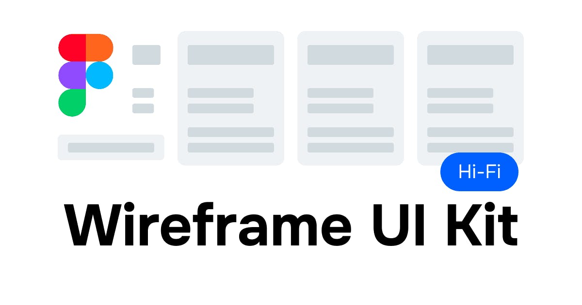
Hi-Fi wireframe ui kit for figma by Seen Design Lab Wireframe UI Kit for Figma with ready-to-use components for web, mobile, and SaaS products. Built to help designers, startups, and founders move fast, design smart, and launch better — by Seen Design Lab.
Based on the OpenHunts listing, Seen Wireframe UI Kit works as a design tool. Check the project description, screenshots, and website link before trying it.
Seen Wireframe UI Kit is listed as freemium on OpenHunts. Check the official website for current plan limits, trials, and billing details.
Seen Wireframe UI Kit is best for people comparing design tools tools on OpenHunts, especially people using web, mobile, and desktop platforms.
Use the related projects section and category pages on OpenHunts to compare Seen Wireframe UI Kit with other design tools tools by platforms, pricing, and community activity.
These tools are selected from similar categories, platforms, and community activity on OpenHunts.

Mockplus is an all-in-one product design platform that streamlines prototyping, collaboration, and design system creation. Key features include:Interactive Prototyping: Create interactive web and app prototypes with ease.Wireframing: Build testable wireframes online quickly.UX Design: Design user experiences collaboratively with your team.Ideal for:UX/UI DesignersProduct ManagersWeb and App DevelopersMockplus offers a comprehensive suite of tools in one platform, eliminating the need for multiple subscriptions and simplifying the design process.

tiny.SUPPLY is a custom avatar service that creates simple, minimalistic profile pictures. Key features include:custom hand-drawn avatar in SVG format, made in Figma.clean and simple aesthetic for profile pictures.reflecting character's persona, unique for each member.Ideal for:Individuals seeking a unique and personalized profile picture.Companies looking for consistent branding across employee avatars.Crypto and gaming enthusiasts.

Shadcraft is a production-ready UI kit and React component library built on top of shadcn/ui.It helps designers and developers move faster by starting from real components, real patterns, and real code, not abstract design systems or placeholder UI.Shadcraft includes a fully-featured Figma UI kit that mirrors the shadcn/ui ecosystem, plus an optional React kit that installs directly into your project via the shadcn CLI. Components, variants, tokens, and structure are aligned end to end, so design and code stay in sync.You get:All shadcn/ui components and blocks, ready to useAdvanced theming with design tokens and globals.cssA Figma kit that matches production code structureA React kit with clean, extensible componentsPatterns built for real products, not demosShadcraft is for teams who want to skip the setup, avoid rework, and ship high-quality interfaces faster, whether you are designing, building, or doing both.Built for modern stacks. Ready for production on day one.

700+ hand-crafted icons in 1,400+ variants built for modern products. Designed to make professional interfaces feel human.Perfect for teams who care about detailsWhether you're designing product UIs, building marketing sites, or creating presentations that actually engage, Amicons gives your work the friendly edge that users notice and remember.Trusted by: Product designers, UI/UX teams, Marketing professionals, Developers, Content creators.What you get✅ 700+ meticulously hand-crafted icons (no AI, just human artistry).✅ 2 complete styles: Line + Solid = 1,400 total variants.✅ 43 organised categories. Find what you need instantly.✅ Professional Figma file with searchable components.✅ SVG files in organised folders.✅ High-res PNG exports for any project.✅ PDF files for print materials.✅ Lifetime updates. Icons are added over time. Last update: June 2024.Use them everywhereLanding pages • Mobile apps • Websites • Pitch decks • Presentations • Print materials • Marketing campaigns • Product interfacesWhy people choose Amicons🎯 Quality first – Every one of 700+ icons crafted for absolute consistency😊 Friendly, not cutesy – Professional warmth your users will actually appreciate🔍 Smart organisation – Comprehensive tagging makes finding icons effortless🔄 Always growing – Free lifetime updates mean your library keeps expanding

A component library that provides pre-built UI blocks and components for Shadcn UI, React, and Tailwind projects. Key features include:Extensive Block Library: Access a vast collection of pre-designed UI blocks for various use cases.Component Variety: Utilize a wide range of Shadcn UI components.Seamless Integration: Copy and paste components directly into your project or install via the Shadcn CLI.Ideal for:Web developersUI/UX designersFront-end developersShadcnblocks streamlines the development process by offering ready-to-use, customizable UI elements, saving time and effort in building visually appealing and functional web applications.